Bounties of Babylon
Hexagons weren't enough to save a game from bad presentation and design
I wrote some weeks ago about how digital versions of board games can help to expand an already good experience now that the game can use the help of algorithms and computers. But what can be possible when a board game is digital from the ground-up? With no restrictions on physical components or human brains, designs can be even experimental and different, right? Unfortunately, Bounties of Babylon isn't a good answer of this question.

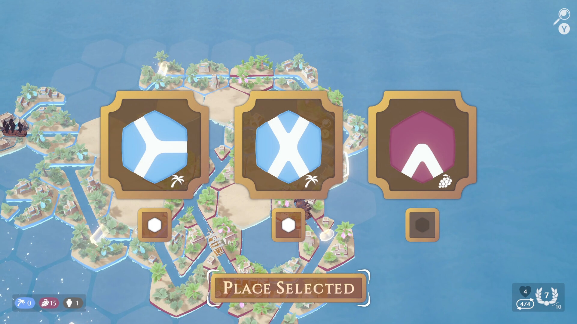
Your goal in a run of Bounties of Babylon is get an amount of victory points in each round, traveling through an hexagonal grid that is expanded each turn. At the start of a turn, you choose tiles to expand the map (and the river your ships can traverse on), in a Carcassonne-like experience. After that, you roll the dice to move and try to get extra artifacts or find merchants to exchange goods for victory points. There's also a need of creating paths through tiles that produce the same thing, so you can collect more in the end of the round.
There is a lot to say about the odd design of this game, at least for me. Although a "full run" of Bounties of Babylon can have seven-ish rounds, everything is reset from one round to another — except for victory points that you accumulate for a high score. It's always a new map, with new goals and an empty inventory. The problem happens when some of the rounds have only 2 or 3 turns: there's no time to actually do any type of strategy when you have so little time to act. It felt like a bad designed procedural puzzle at times.

And then you have an unexpected participation from the Roll and Move mechanic. If you are from the board game hobby nowadays, you already know how much I'll trash talk this now, but, why, in the year of 2024, ARE WE STILL USING ROLL AND MOVE THIS WAY? Even if you did well in the tile placement, your ships will only move based on dice rolls. And, because you probably only had 3 turns, there's also no time to correct yourself and recover from the bad luck. Strange on paper, frustrating on reality.
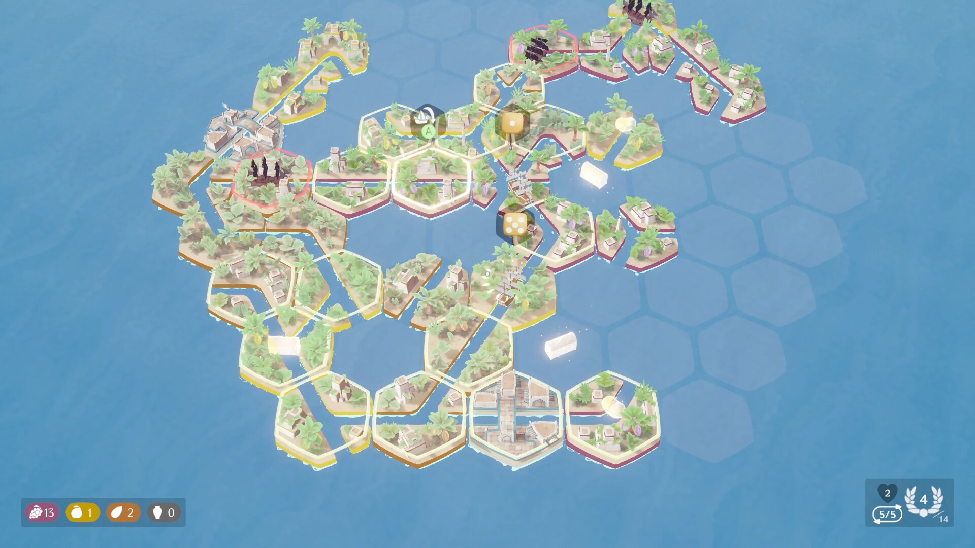
If those strange design choices weren't enough, Bounties of Babylon's visual presentation isn't really on the side of good readability. The game looks fine with its low-poly graphics, to be fair, but it's so hard to visualize what's happening in the game sometimes. For example, the only way to know if a tile will produce goods at the end of a turn is if some of the objects (like coconuts) are blinking white. With an interface like this, my turns doubled on time so I could read the board and the game situation.
I truly believe that the digital media can be an amazing tool for game designers to bring tabletop gaming to another level — not only as a "second option", but also as a medium to reach the (until) impossible. Bounties of Babylon, although, with its odd design choices, outdated mechanics and bad presentation, cannot be used as an example for good use of this medium. At best, it felt like a half-baked puzzle that was frustrating to play and hard to recommend, even for fans of Carcassonne, Catan or strategy games.